Case Study CAMPUS
CAMPUS is a responsive web app designed to connect students online to facilitate peer-to-peer learning, support, feedback, and motivation.
the Challenge
In times of the pandemic, how can students study together and keep up their enthusiasm?
The Approach
1. UNDERSTAND
Briefing and objectives
2. IDEATE
Persona and user flows
3. DESIGN
Wireframes and style guide
4. PRESENT
Mockups and prototype
1. Understand
The Objective
Connect students online to facilitate peer-to-peer learning, support, feedback and motivation.
2. Ideate
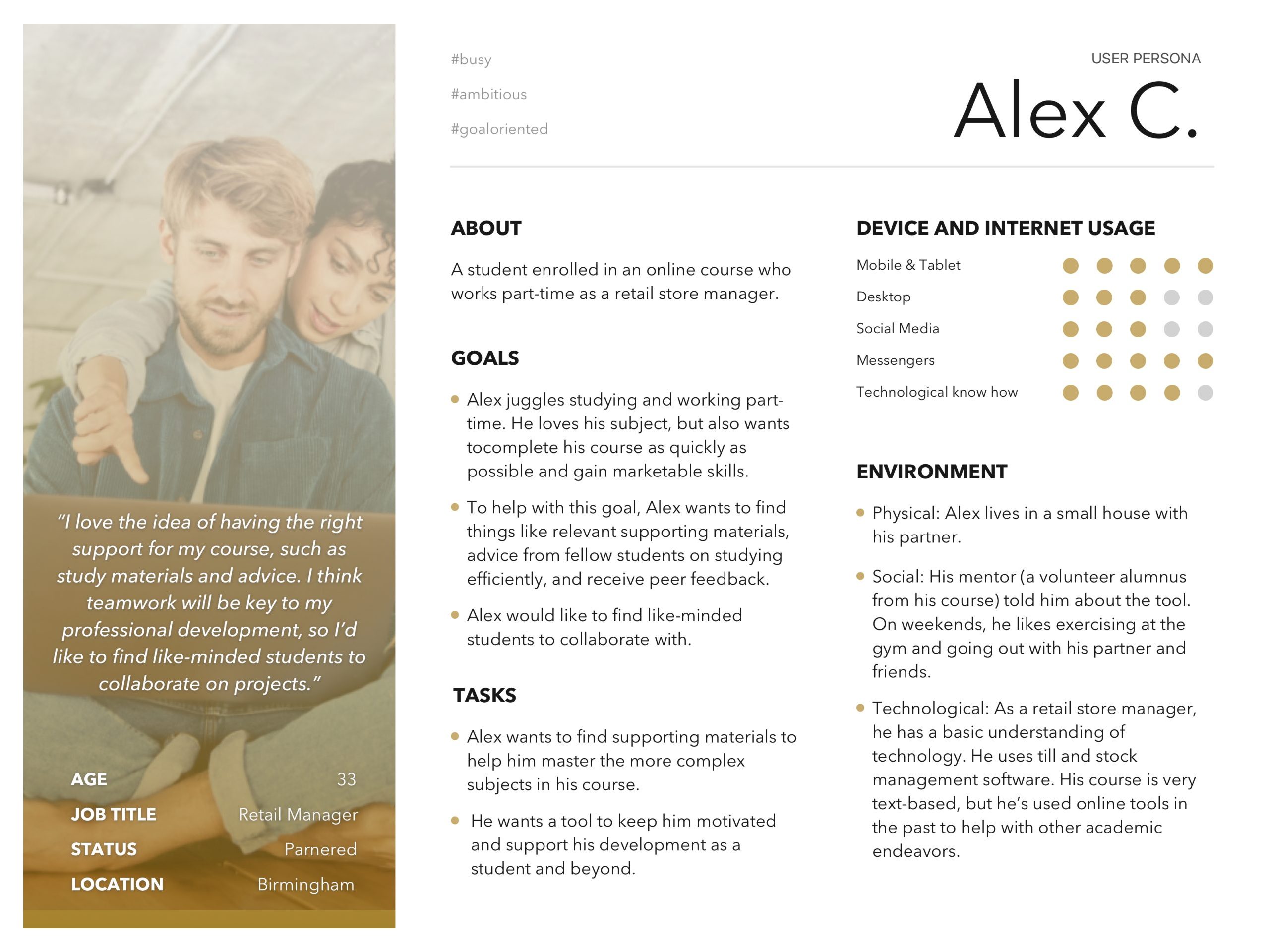
User Persona
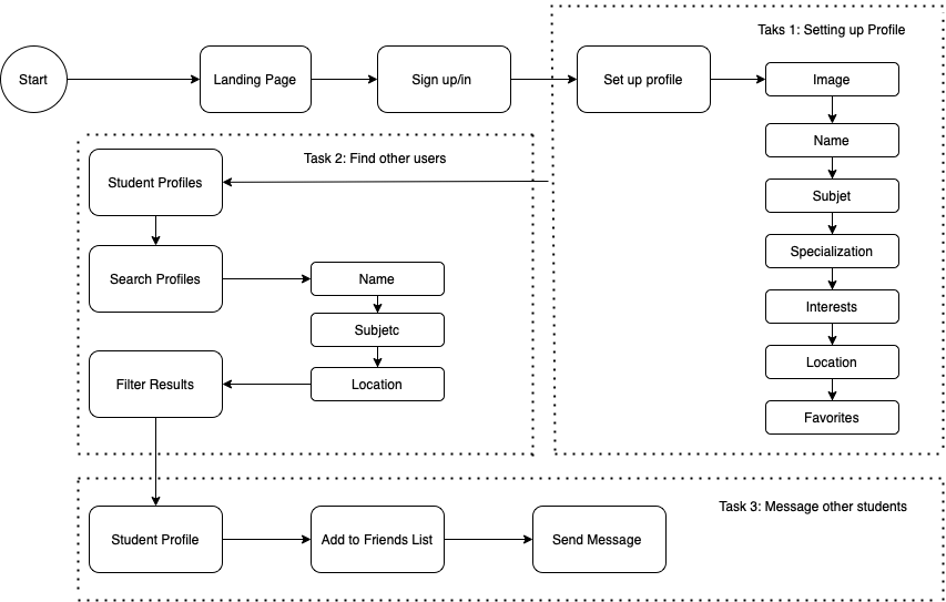
User Flows
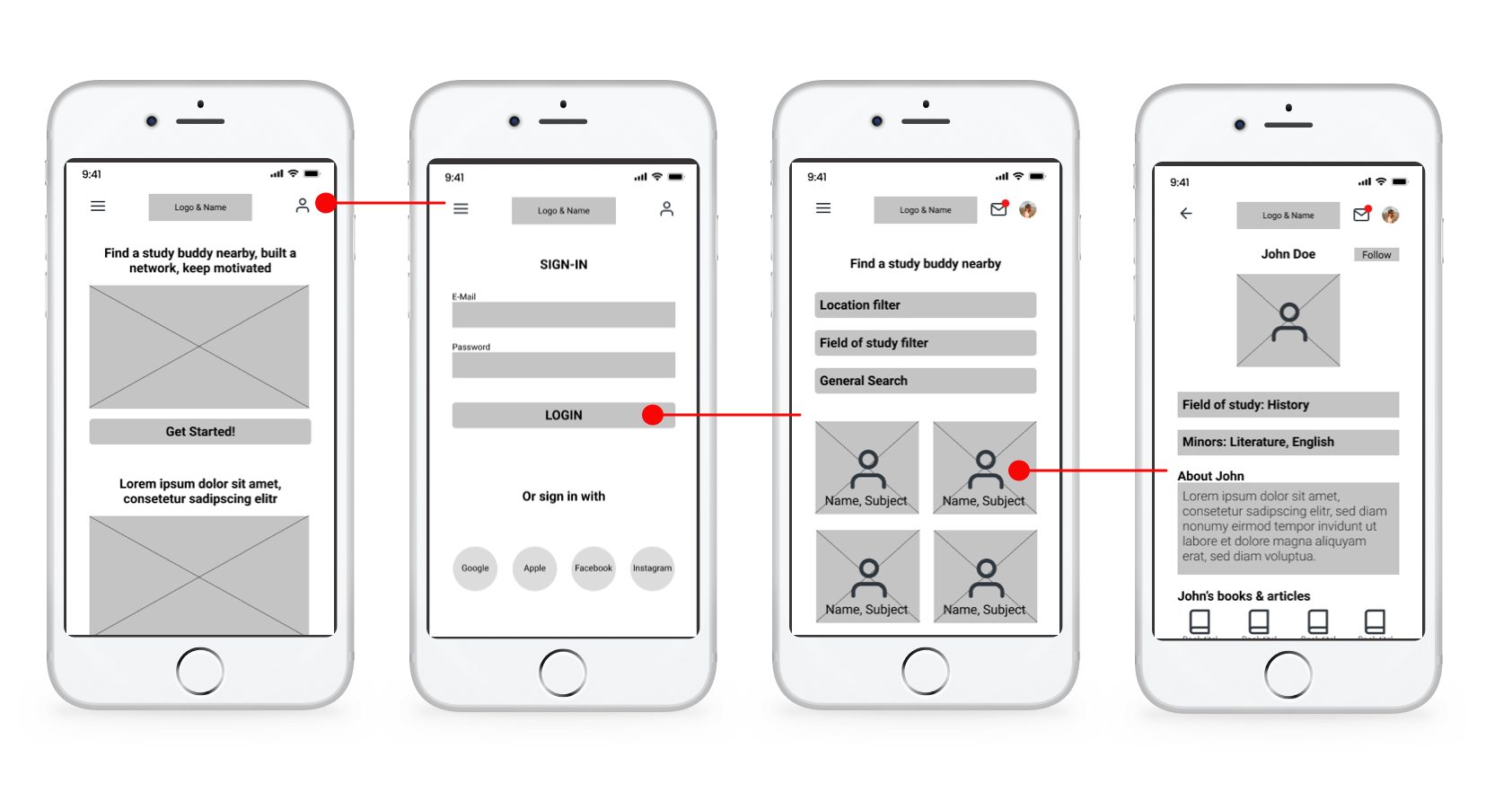
Example for user flow for „login:“
3. Design
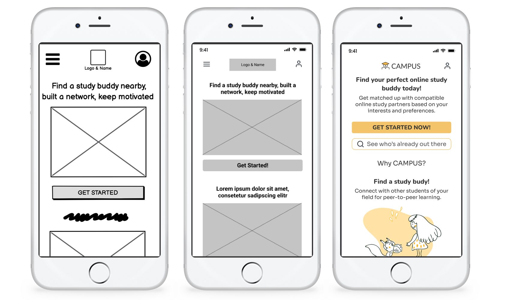
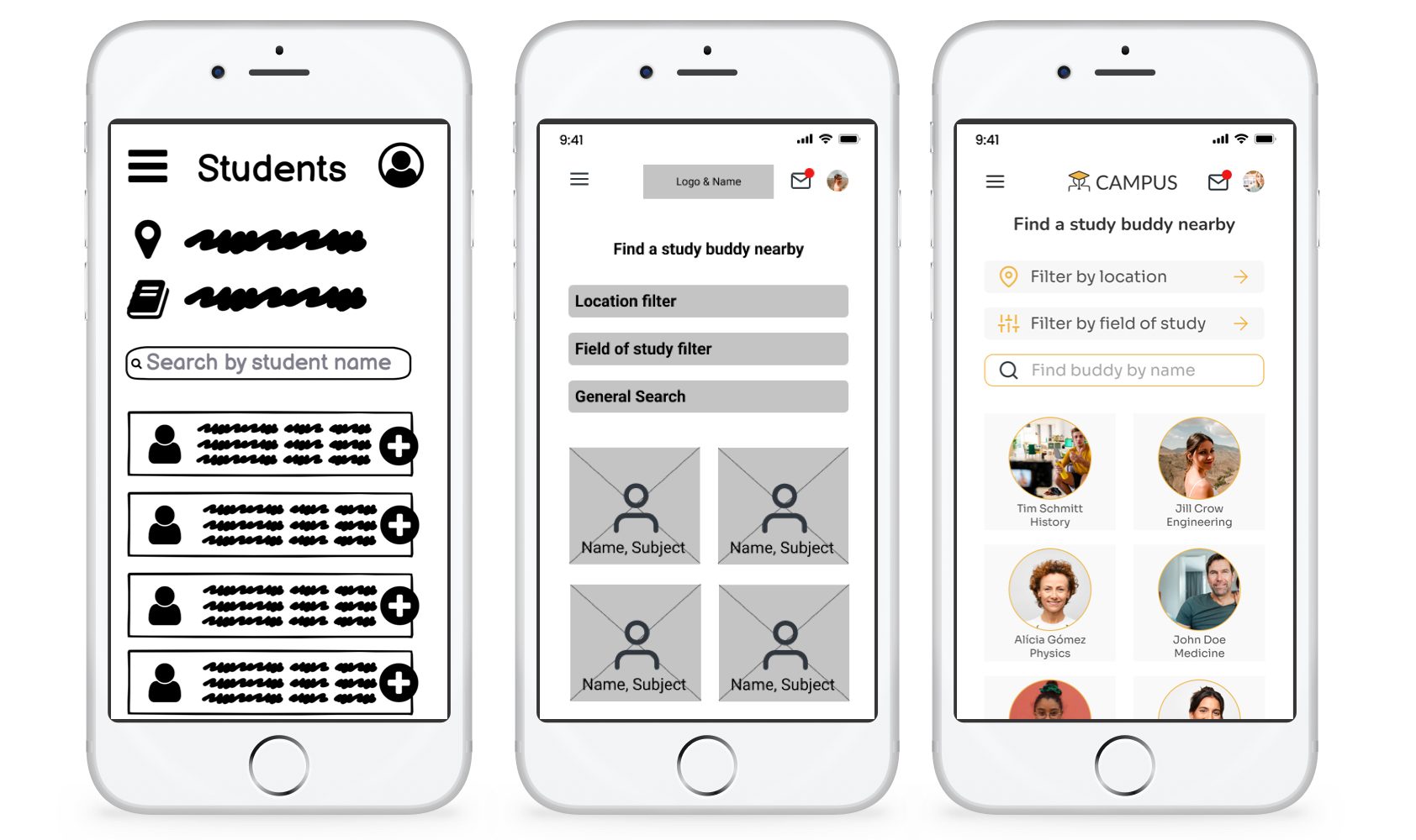
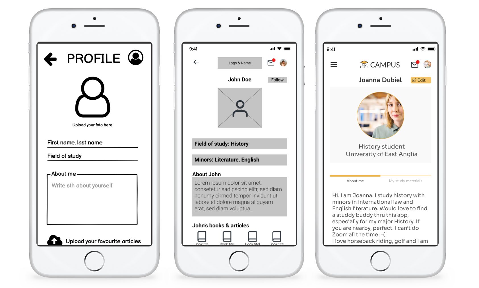
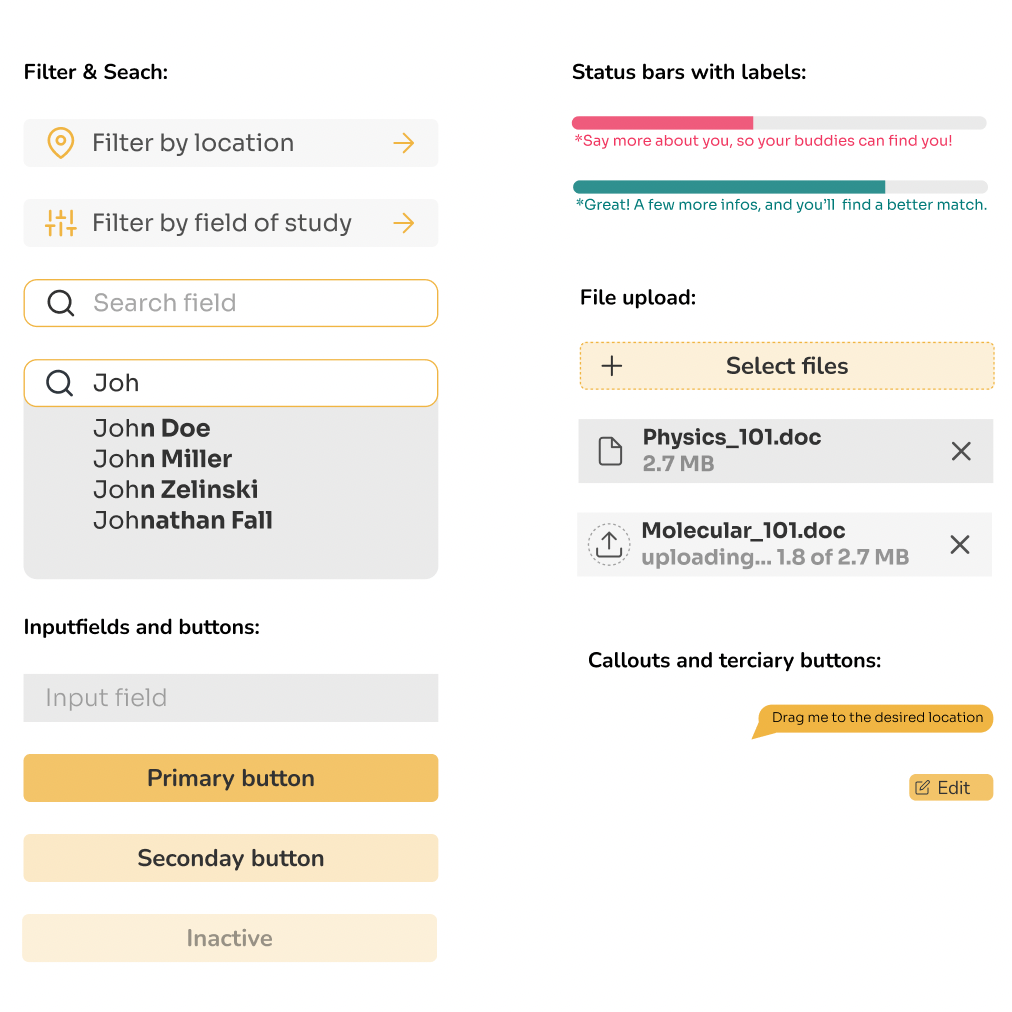
Evolution of Wireframes
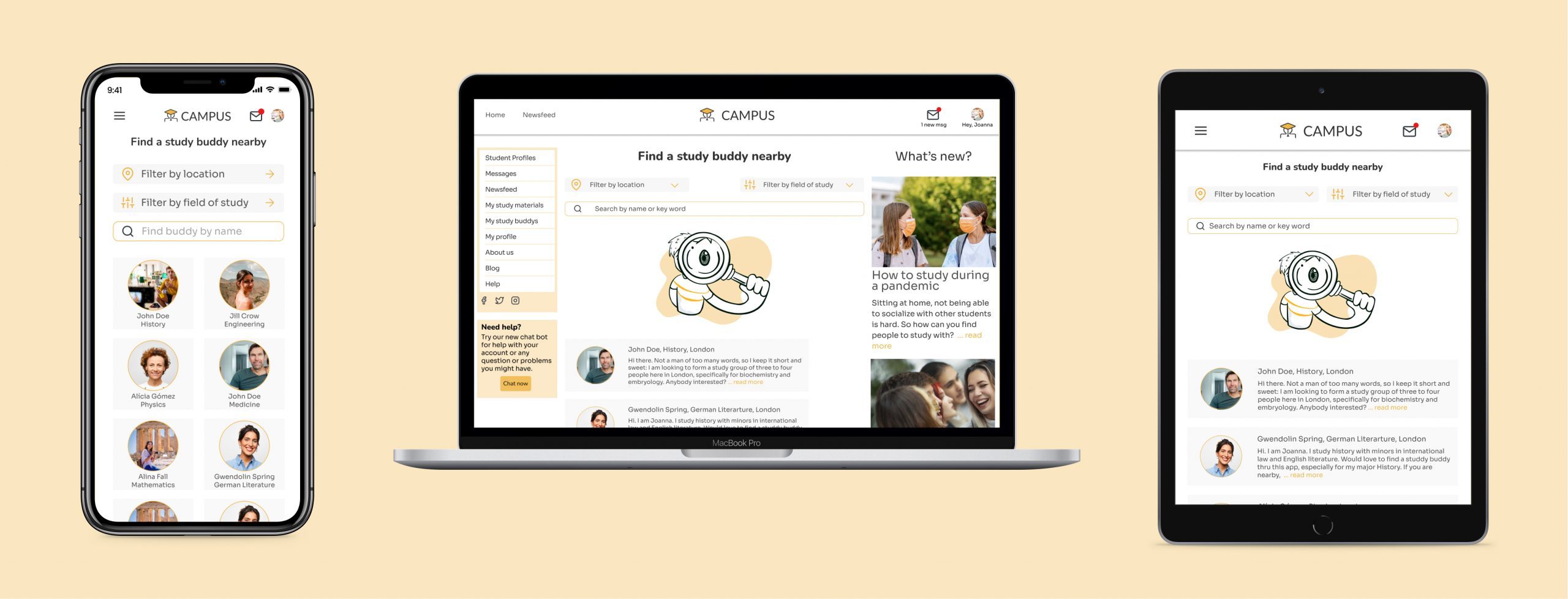
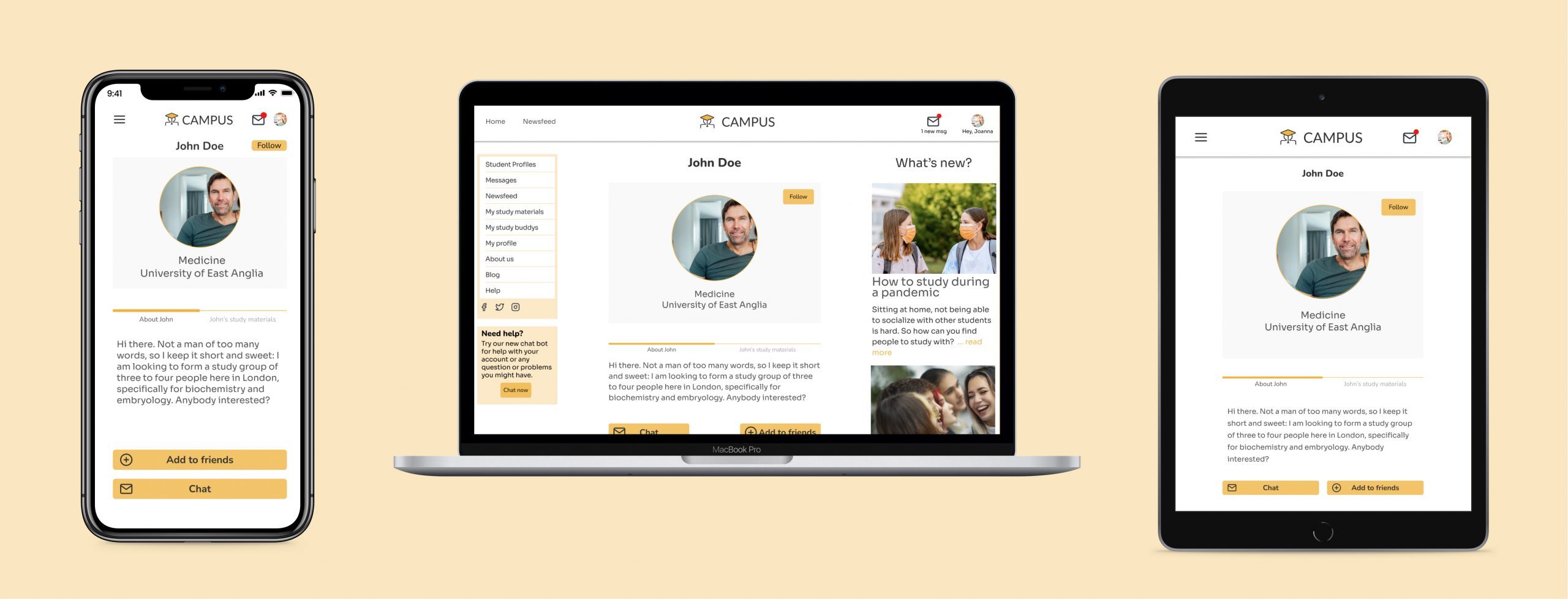
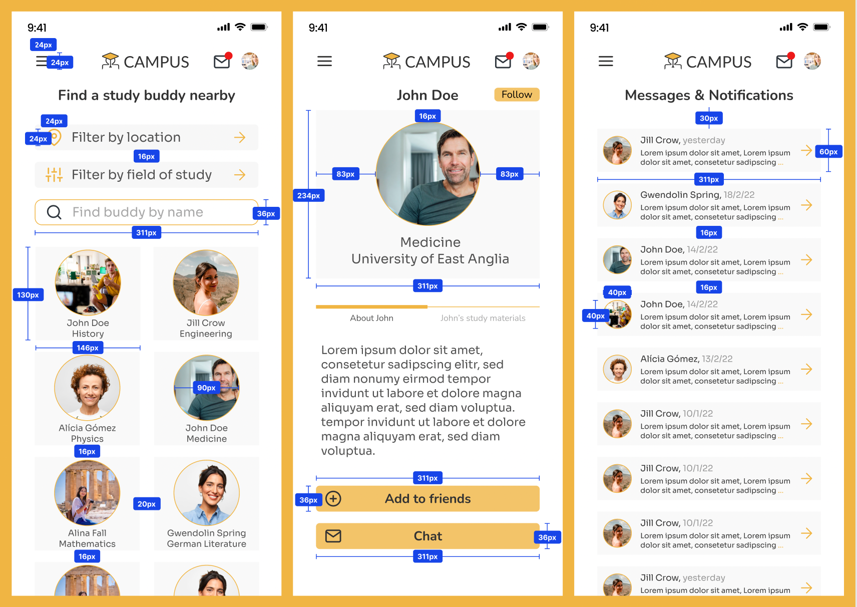
Based on the three main user flows, low fidelity wireframes were created in Balsamiq and mid-fidelity and high-fidelity in Figma. Here examples for the three responsive breakpoints: landing page, start page and profile.
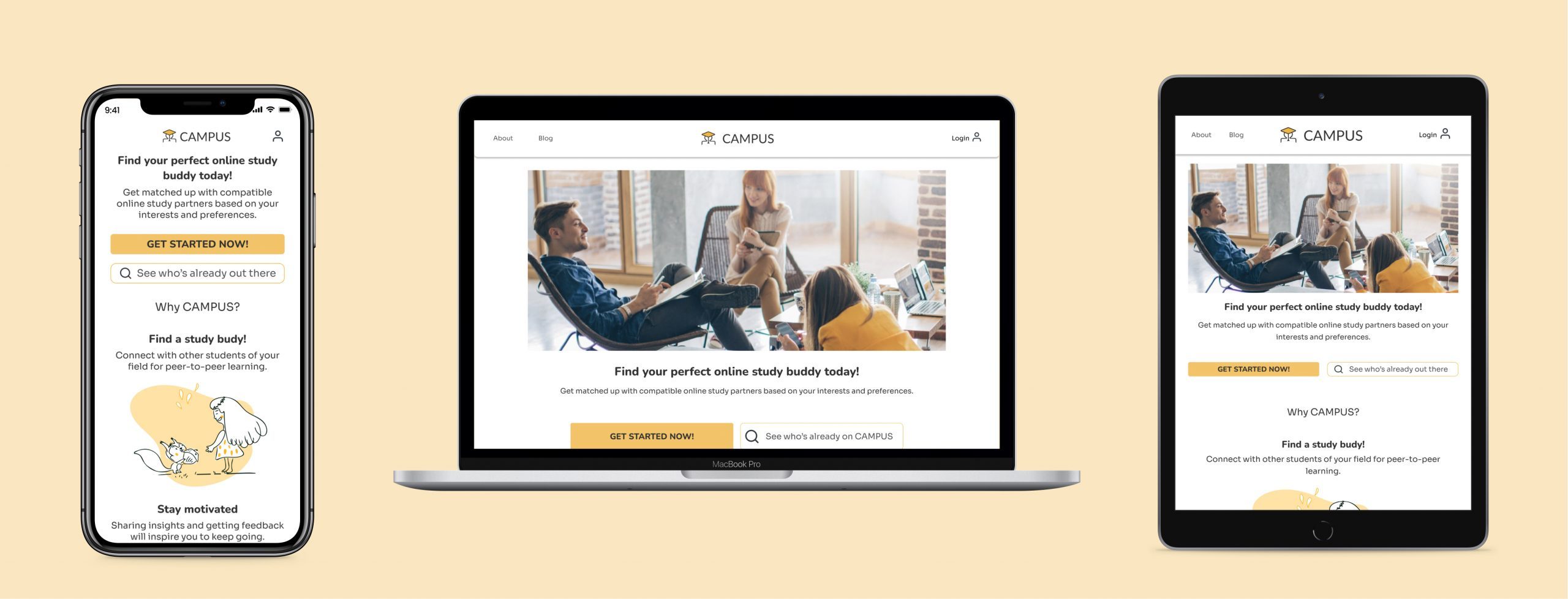
Breakpoints
Breakpoints were defined for the landing page, start page and the profile page. With a margin of 32 and gutters of 20px. Columns? Mobile: 4, tablet: 8, desktop 12.
4. Present
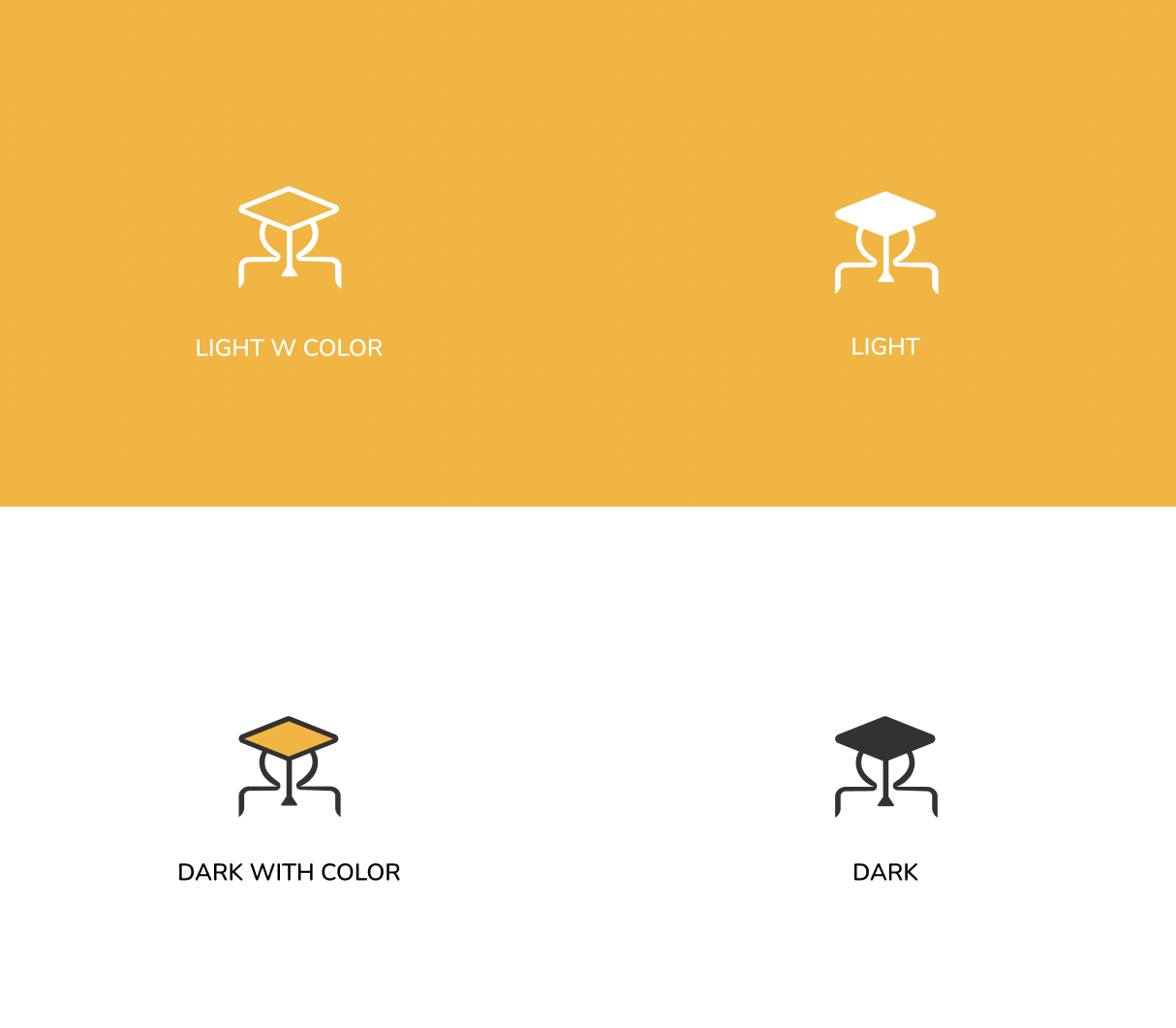
The Logo
“The graduate” is basically the icon of a person wearing a square graduation cap. Corners are smoothed and the standard version is “dark with color,“ but can be used in a variety of color palettes to adapt to different backgrounds and applications. ”
Typography
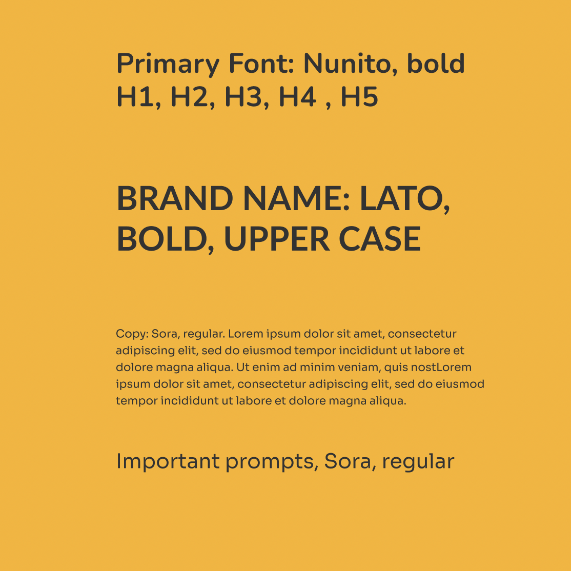
Headlines and buttons usually use the friendly and modern non-serif Nunito. To avoid a look thats too cartoonish (remeber, one of our brand values is “reassuring”), we use the more squarish and serius Sora for body copy.
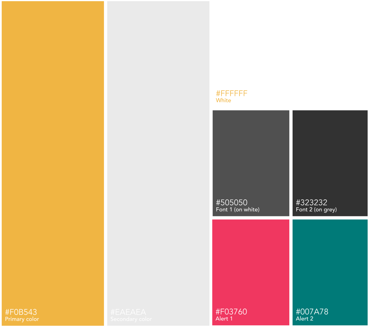
Brand Colors
Orange (accent) gives the app a lively energetic feel, while greys (and white) keep the rest of the palette neutral. The varying shades of grey help increase contrast which results in improved readability. The brand values friendly and welcoming are front and center in this color palette.
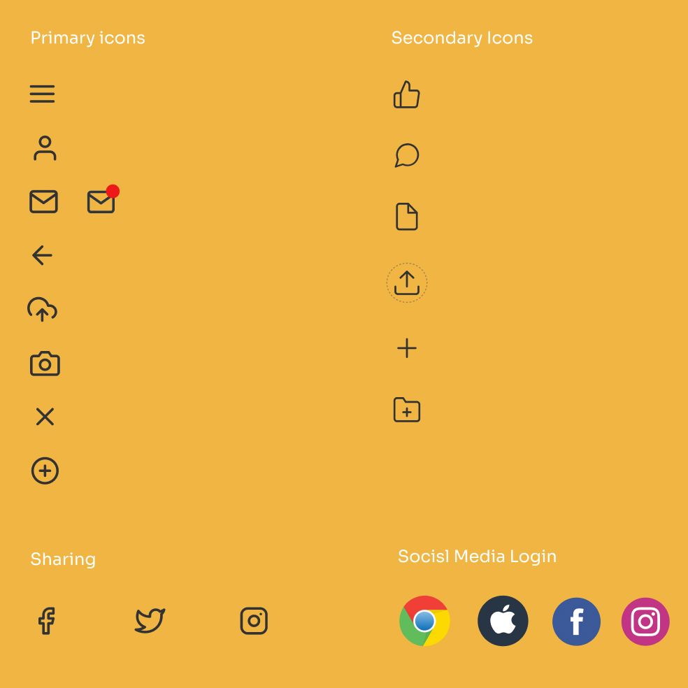
Icons & UI Elements
Icons come in two strokes: 1.5. (primary) and 1.0 (secondary). Seconday icons are only used on tiles. All icons are 24×24 px. Avatars are always round, have an orange stroke and are always placed on tiles. Tiles never have rounded cornes, strokes or shadows and are either grey (accent color) with 30 percent saturation, or white.
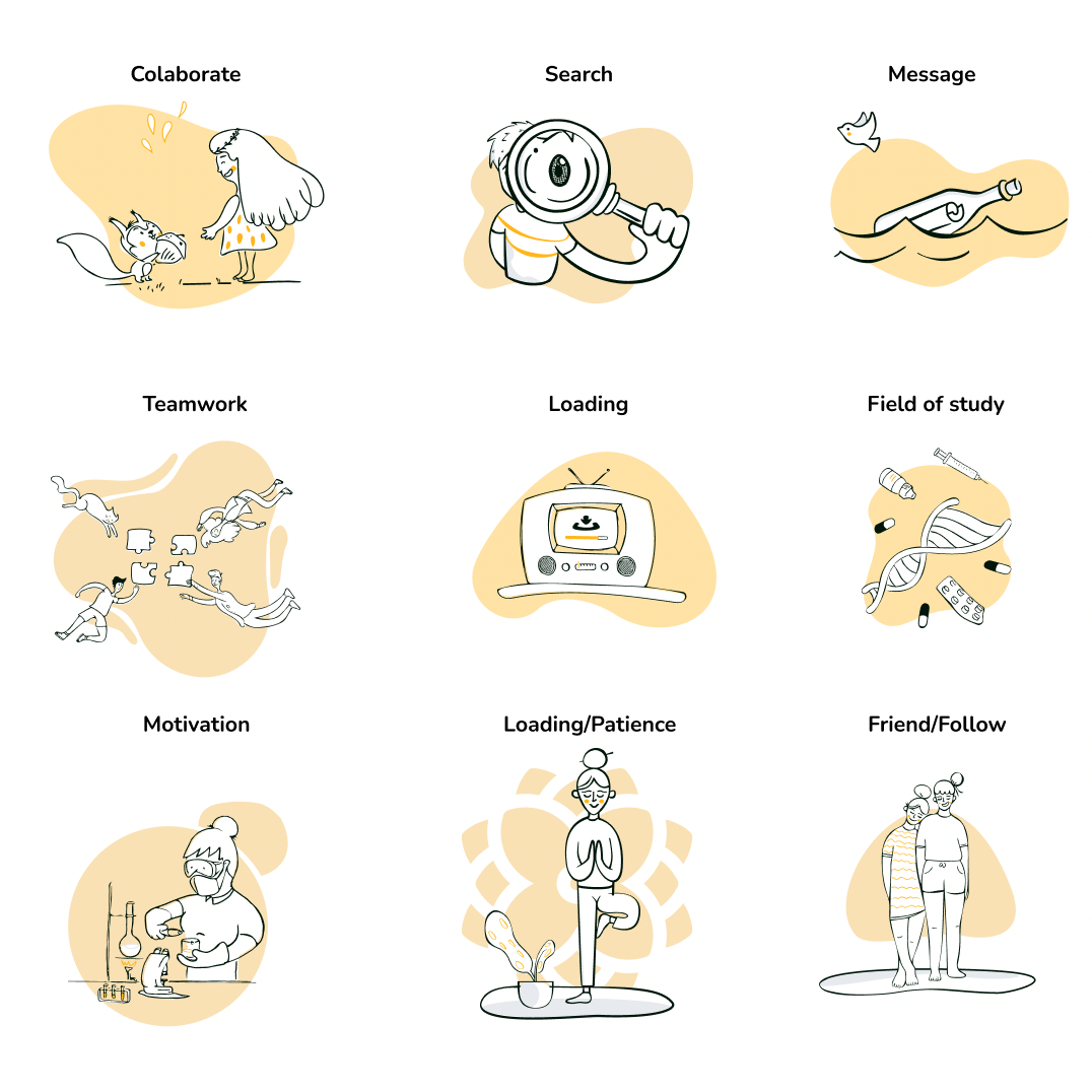
Illustrations
Illustrations* are used instead of images to bring fun and life to the CAMPUS web app. Illustrations always consits of black strokes on a orange blob (primary color) with 40% saturation. The following examples will give you an impression of the look and feel of our illustrations and their application.
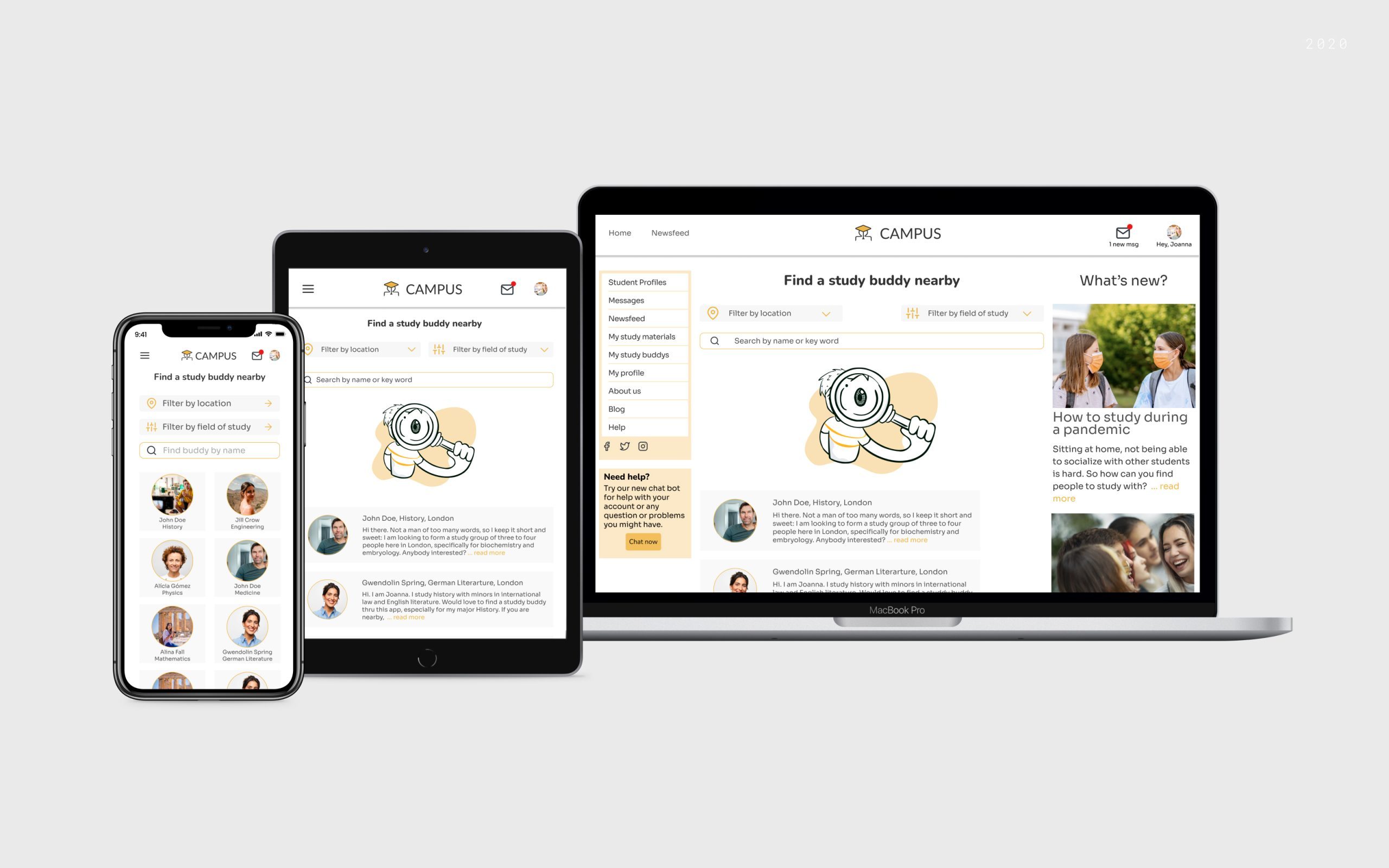
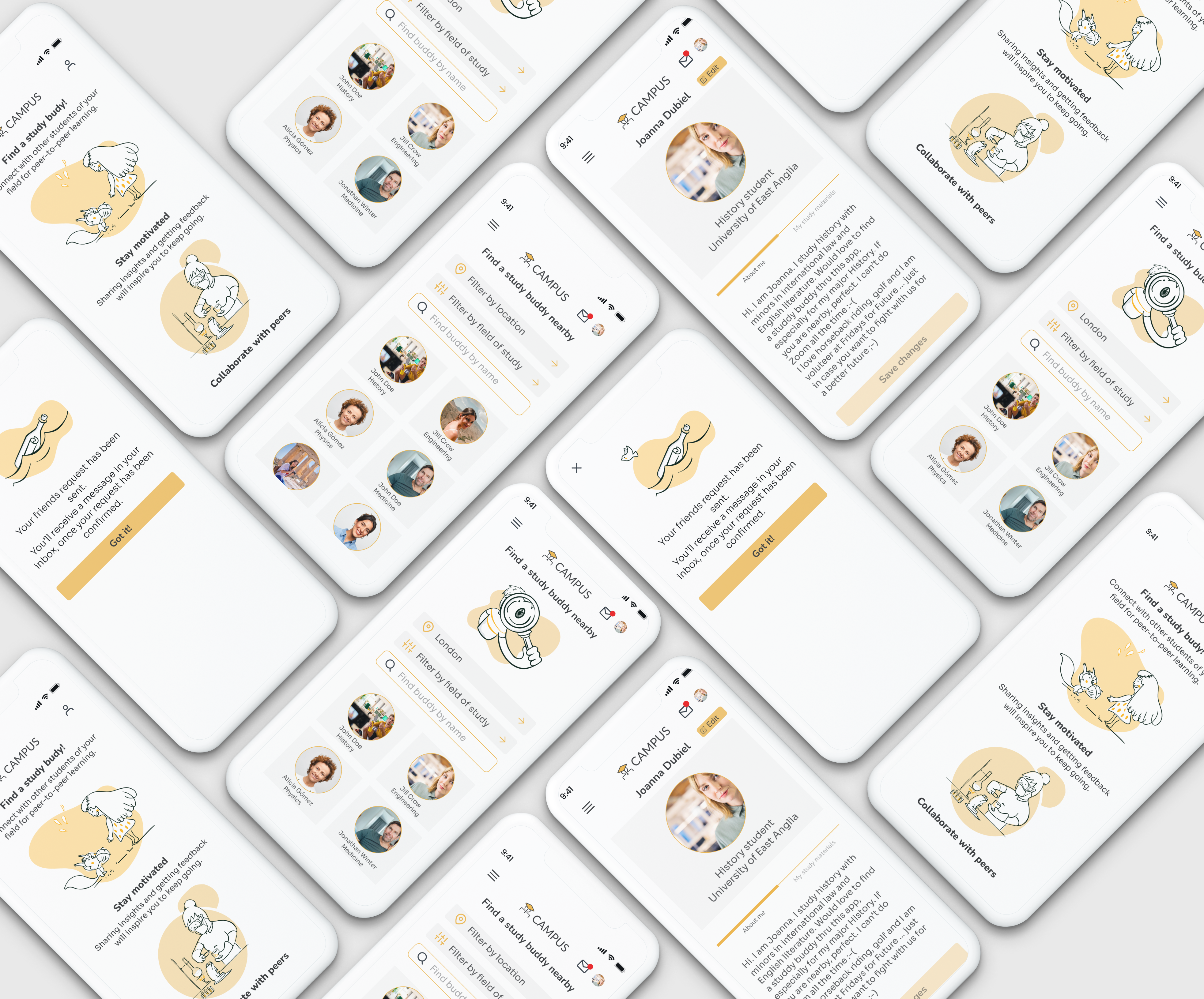
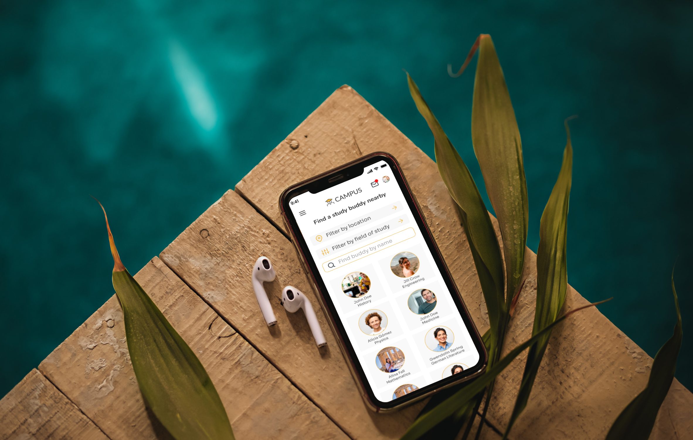
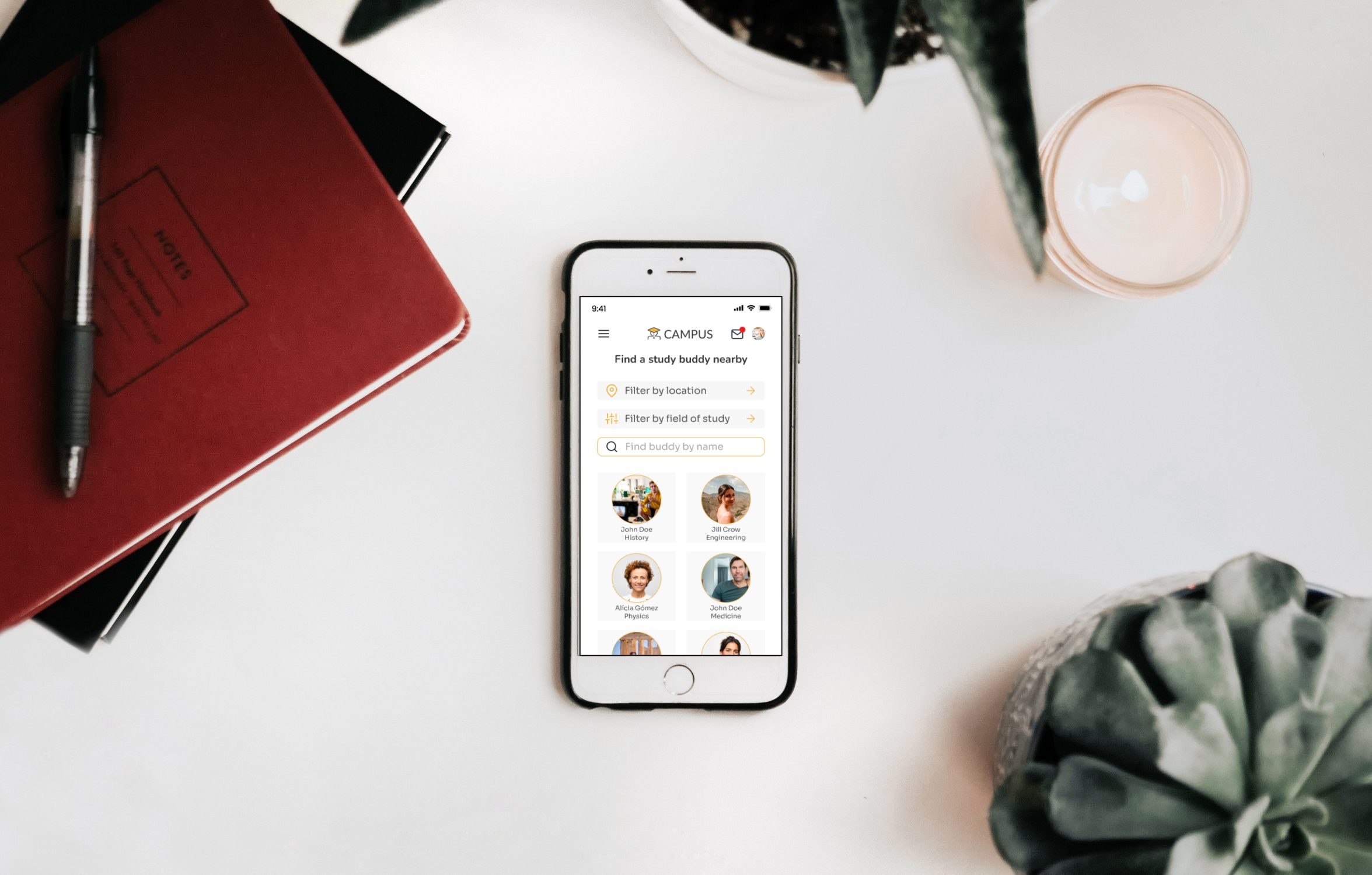
Final Mockups
Before you go…don’t forget to visit my copywriting portfolio
*Illustrations from Figma community