Case Study ExpatBuddy
ExpatBuddy is a web app designed to help expats and migrants adjust to their new home by offering useful tools and professional expert advice.
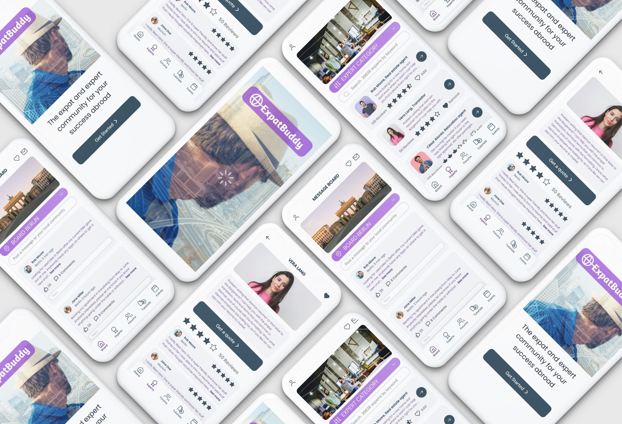
the Challenge
What if there was an app for expats?
The Approach
1. UNDERSTAND
Competitive analysis, research & user interviews
2. IDEATE
User personas, user journey, information architecture
3. DESIGN
Wireframing, prototyping, and testing, testing, testing
4. PRESENT
Tone of voice, design language, handover assets
1. Understand
Surveys & User Interviews
Through a filter survey I identified users between 25-35 with different cultural backgrounds who had lived at least one year abroad. With surprising results:
Competitor Analysis
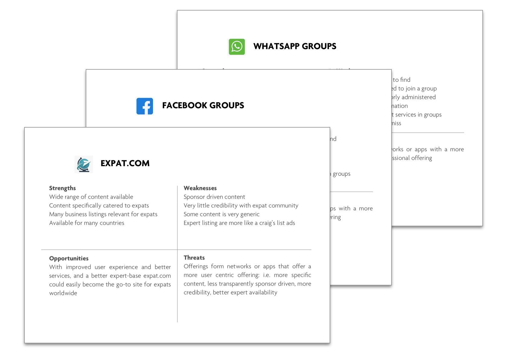
A competitive analysis revealed: many tools expats use, such as facebook groups, WhatsApp groups and websites such as expat.com, tealit.com, forumosa.com, gokunming.com, lack important aspects:
Lack Of Moderator
No Quality Controls
Limited Accessibility
No Trust In Experts
The actual needs and painpoints of expats
Research uncovered, however, that expats have very specific needs that have not yet been met by an app or online tool in a comprehensive way: How do I find lawyers, tax accountants or doctors nearby, who speak English? Where do I find other expats in my city who can help me with problems? Why is there no platform which offers entertaining tutorials specifically for expats?
Community
Users are looking for likeminded expat-buddies nearby, i.e. location based communities
CURATED CONTENT
They are also looking for tutorials, how-to’s, and entertaining explainers specifically for expats
EXPERT ADVICE
They are ready to pay for advice and services when the experts are part of a trusted community
2. Ideate
User Personas
„I don’t mind paying for expert advice, but is has to be excellent and trustworthy“
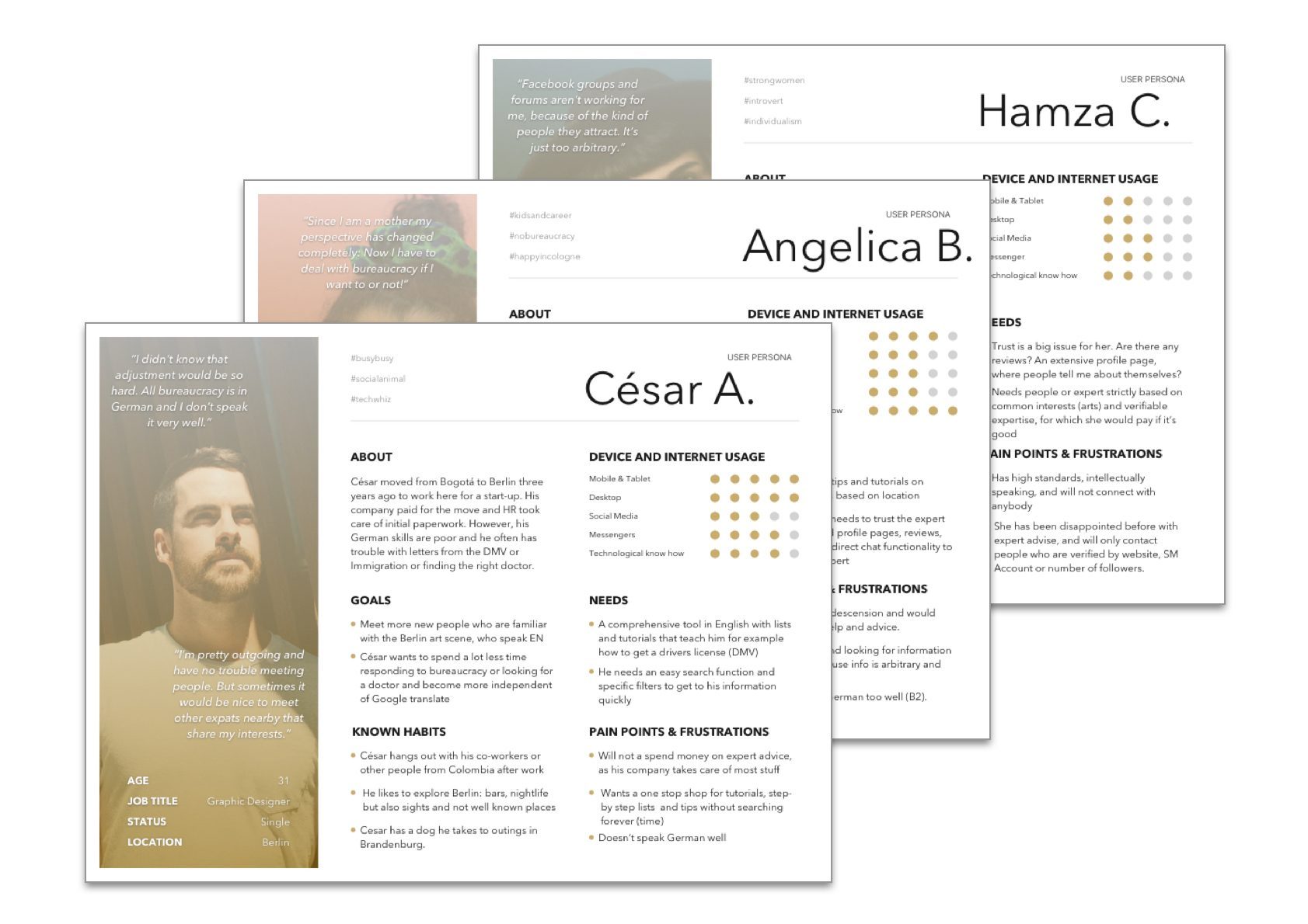
Feedback from users was aggregated to user personas.
User Journeys
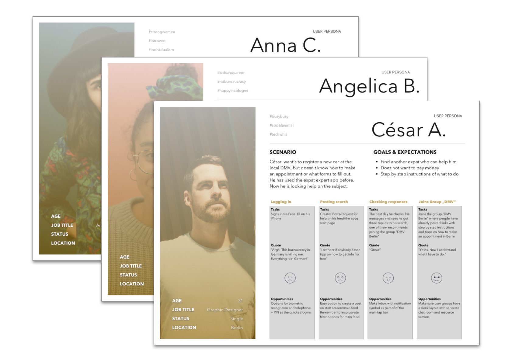
How do people actually use the product? This is a fundamental question. User journey mapping is an excellent exercise that can shed light on that. In this case: booking and expert, for example a translator. Or finding information (i.e. a tutorial) on how to register a car at the DMV.
Wireflows
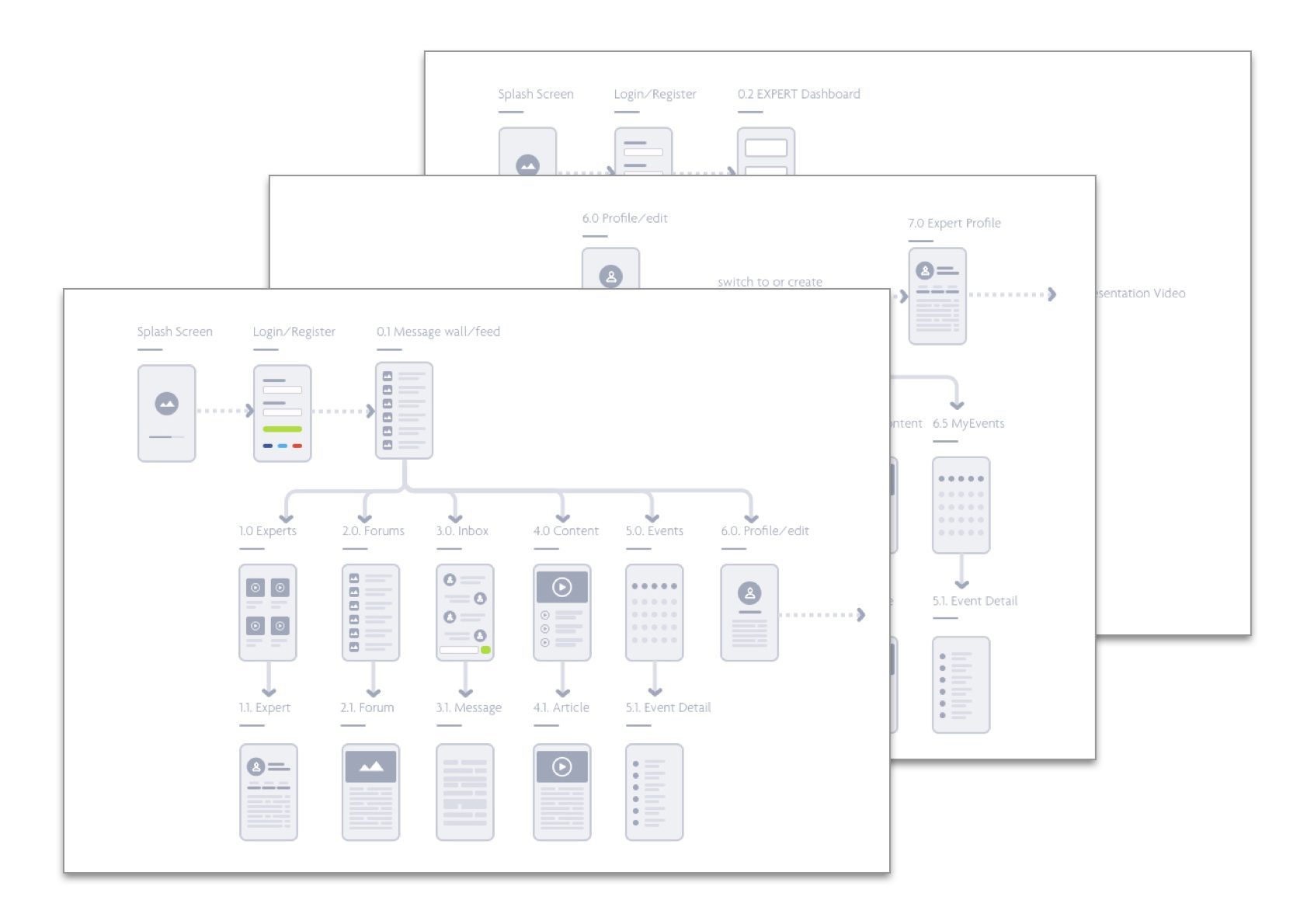
As there is no comparable app that could have inspired the design, page types and user flows were mapped to get a better understanding of how to combine aspects, such as community, expert listings, tutorials and forums.
3. Design
Wireframes & Prototypes
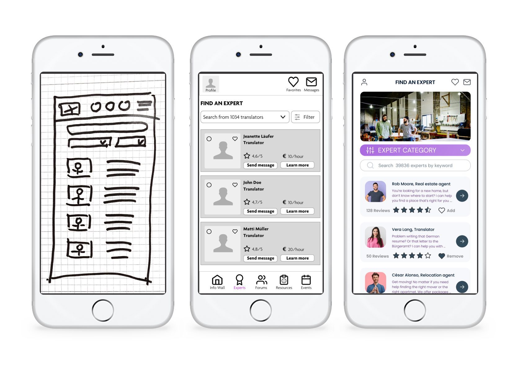
To determine the main functionality of the app, iterative testing produced improved wireframes and prototypes.
User Testing
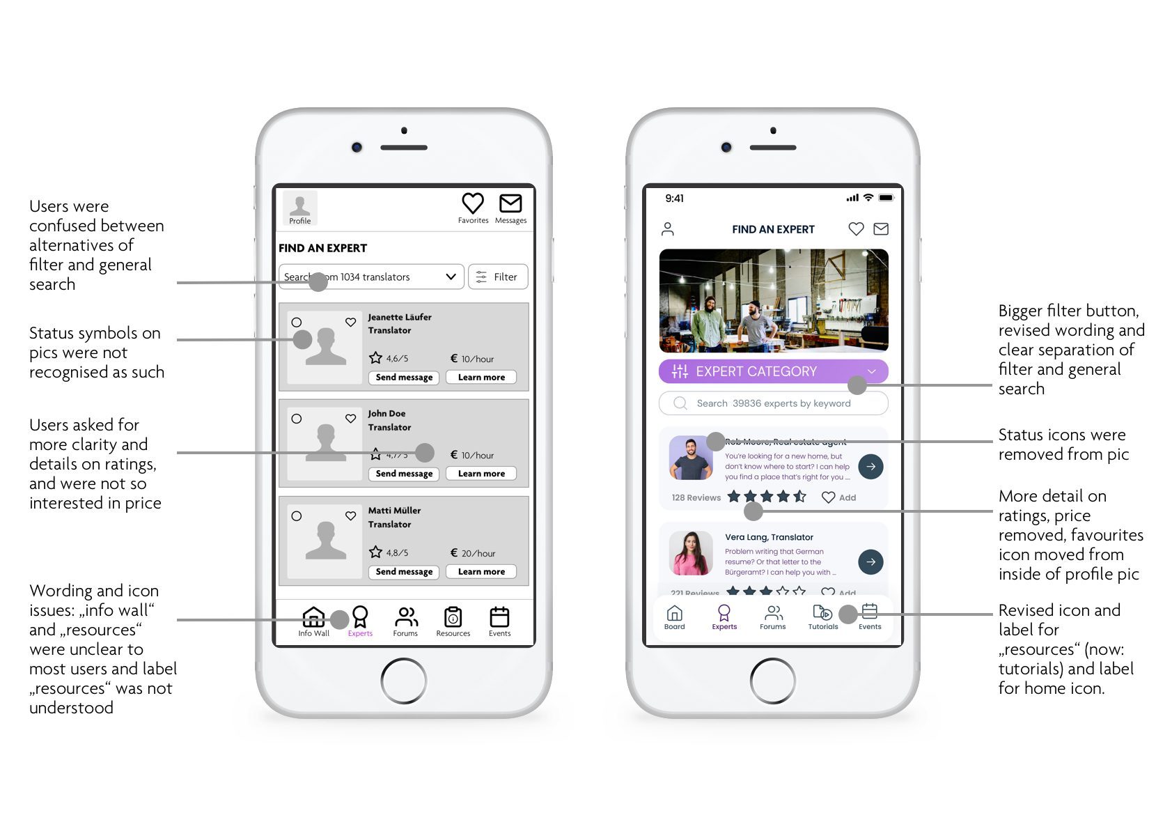
The objective of the usability testing was to determine if participants understand what the app is about (i.e., an application for finding local community support and expert advice) and the value it provides. Specifically, users were asked to navigate the prototypes and perform specific tasks, such as finding and booking an expert.
4. Present
Look & Feel
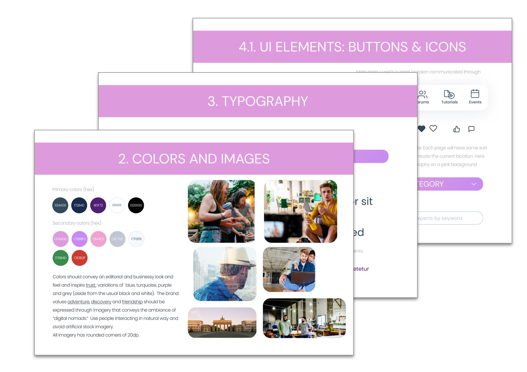
Colors should convey an editorial and businessy look and feel and inspire trust: variations of blue, turquoise, purple and grey (aside from the usual black and white). The brand values adventure, discovery and friendship should be expressed through imagery that conveys the ambiance of “digital nomads” and use people interacting in natural way.
Tools used
Sketch
FIGMA
InVision
Card sorting
Before you go…don’t forget to visit my copywriting portfolio